In this article we will look at how to decompose a React component into smaller components. We will look at the steps involved and the order in which they should be performed.

Consider this scenario. You inherit a React application or maybe revisit one of your older applications and find that while the code works fine one of your components is a bit too complicated and you wish to refactor it into a series of smaller components.
In this article we will take just such a scenario and go through the process step by step. The objective is to learn what steps are necessary and in what order to perform such a decomposition.
The Initial Application
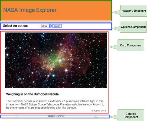
This is a very simple React application that fetches some images from the NASA API and allows the user to scroll through the returned images.

The entire application is written as just one component named App. The full code for this component looks like this:
import React, { useState } from "react"
import "./App.css"
import moment from "moment"
const App = () => {
const [images, setImages] = useState([])
const [count, setCount] = useState(0)
const [image_type, setImageType] = useState("nebula")
const [error, setError] = useState("")
const [page, setPage] = useState(1)
const [currentImage, setCurrentImage] = useState(-1)
const fetchImages = () => {
const url = `https://images-api.nasa.gov/search?q=${image_type}&media_type=image&page=${page}`
fetch(url)
.then(res => {
if (res.ok) {
return res.json()
}
throw new Error("Problems getting the data.")
})
.then(({ collection }) => {
console.log(collection)
const {
metadata: { total_hits: count },
items,
} = collection
const images = items.map(item => {
const { center, date_created, description, title } = item.data[0]
const { href } = item.links[0]
return { center, date_created, description, title, href }
})
setCount(count)
setImages(images)
if (count > 0) {
setCurrentImage(0)
}
})
.catch(error => setError(error.message))
}
const imageCard =
currentImage > -1 ? (
<div className="card">
<img src={images[currentImage].href} alt={images[currentImage].title} />
<div className="card_content">
<h3>{images[currentImage].title}</h3>
<div className="card_description">
{images[currentImage].description}
</div>
<div className="card_date">
{moment(images[currentImage].date_created).format("DD MMMM YYYY")}
</div>
</div>
</div>
) : (
""
)
const controls =
currentImage > -1 ? (
<div className="controls">
<button
disabled={currentImage < 1}
onClick={e => setCurrentImage(currentImage - 1)}
>
<
</button>
<div className="control_count">
Image {currentImage + 1} of {count}
</div>
{currentImage < count ? (
<button onClick={e => setCurrentImage(currentImage + 1)}>></button>
) : (
""
)}
</div>
) : (
""
)
const artifacts = ["planet", "nebula", "galaxy", "pulsar"]
const options = artifacts.map((a, i) => (
<option value={a} key={i}>
{a}
</option>
))
return (
<div className="App">
<header>
<h1>NASA Image Explorer</h1>
</header>
<div className="options">
<h3>Select An option:</h3>
<div className="options_form">
<select
value={image_type}
onChange={e => setImageType(e.target.value)}
>
{options}
</select>
<button onClick={fetchImages}> Search </button>
{error ? <div className="error">{error}</div> : ""}
</div>
</div>
<div>{imageCard}</div>
{controls}
</div>
)
}
export default AppAs you can see this component is doing quite a lot. That is why we want to decompose it into smaller components. But what are the smaller components and how do we access the data in the component that needs it? We will walk through those steps next.
You can clone or download this version of the code from the starter_app branch on this repository.
Plan the decomposition
Our first step on the this path is to think about which areas of the UI may be refactored into their own components. What you decide is entirely up to you but there are some basic guidelines that you can follow. A component should be as single minded as possible, that is, it should be responsible for just one thing.
Here is one option for decomposing this interface.
Let us then look at the way we can refactor the code.
Header Component
The simplest component to work on is probably the header. This component does not require acccess to any data and in fact is debatable wether it needs to be refactored at all. We will still refactor it here as a first exercise though just to illustrate the process.
Begin by creating a new file named header.js in the src folder. Create a function component and copy the header code from App.js to the new component. It should now look like this.
const Header = () => {
  return (
    <header>
      <h1>NASA Image Explorer</h1>
    </header>
  )
}

export default Header
Next, update the App component to import the Header component.
import Header from "./header"And replace the <header> in the JSX with this new component.
    return (
      <div className="App">
-       <header>
-         <h1>NASA Image Explorer</h1>
-       </header>
+       <Header />
        <div className="options">
Save all files and the output should look the same. The code for this version of the app may be found in the branch named header_component in the repository.
Card Component
Let us then look at the card component. This one requires some data but does not require any callback props so it terms of data it is a little simpler to work with than the other two.
The full code for the card can be found in App.js.
<div className="card">
  <img src={images[currentImage].href} alt={images[currentImage].title} />
  <div className="card_content">
    <h3>{images[currentImage].title}</h3>

    <div className="card_description">{images[currentImage].description}</div>

    <div className="card_date">
      {moment(images[currentImage].date_created).format("DD MMMM YYYY")}
    </div>
  </div>
</div>
For this to work we need access to the images[currentImage] object. we could just pass that as a prop to the card component.
Create a new file in the src folder named card.js and create a function component that accepts a single prop named image.
Return the JSX code as above but replace all references to images[currentImage]. The code forcard.js` should look like this:
import moment from "moment"

const Card = ({ image }) => {
  return (
    <div className="card">
      <img src={image.href} alt={image.title} />
      <div className="card_content">
        <h3>{image.title}</h3>

        <div className="card_description">{image.description}</div>

        <div className="card_date">
          {moment(image.date_created).format("DD MMMM YYYY")}
        </div>
      </div>
    </div>
  )
}

export default Card
Next, import Card into App.js and replace the JSX for the card with the component element. Remember to pass the image object as a prop named image.
import Card from "./card"and
const imageCard = currentImage > -1 ? <Card image={images[cardImage]} /> : ""Once again the application should run as before. The full code for this change can be found in the card_component branch of the repo.
Options Component
The options component is completely defined in the JSX of the App component.
<div className="options">
  <h3>Select An option:</h3>
  <div className="options_form">
    <select value={image_type} onChange={e => setImageType(e.target.value)}>
      {options}
    </select>
    <button onClick={fetchImages}> Search </button>
    {error ? <div className="error">{error}</div> : ""}
  </div>
</div>
There are several things to note about this code though.
- The onChange event of the select box needs to call the
setImageType()method. So we will have to pass a calback prop for that. - The onClick event of the button is set to the
fetchImagesfunction. That too will have to be passed as a callback prop. - The error message stored in the state needs to be passed as a prop.
- The current image type is used as the default value of the select. That needs to be passed as a prop.
So we can start by creating a new file named options.js and create a function component named Options in that file.
This component should accept the four props specified above.
const Options = ({ onChange, onClick, error, image_type }) => {
  const artifacts = ["planet", "nebula", "galaxy", "pulsar"]
  const options = artifacts.map((a, i) => (
    <option value={a} key={i}>
      {a}
    </option>
  ))

  return (
    <div className="options">
      <h3>Select An option:</h3>
      <div className="options_form">
        <select value={image_type} onChange={e => onChange(e.target.value)}>
          {options}
        </select>
        <button onClick={onClick}> Search </button>
        {error ? <div className="error">{error}</div> : ""}
      </div>
    </div>
  )
}

export default Options
In App.js this new component can be imported.
import Options from "./options"And used in the JSX.
<Options
  onChange={imageType => setImageType(imageType)}
  onClick={fetchImages}
  error={error}
  image_type={image_type}
/>
The code with this change can be found in the options_component branch on the repo.
Controls Component
The controls component is similar to the previous one. There are some data that needs to be passed down from the parent as well as a callback prop for the setCurrentImage function.
The JSX code for this component is all defined in the controls const of App.
<div className="controls">
<button
disabled={currentImage < 1}
onClick={e => setCurrentImage(currentImage - 1)}
>
<
</button>
<div className="control_count">
Image {currentImage + 1} of {count}
</div>
{currentImage < count ? (
<button onClick={e => setCurrentImage(currentImage + 1)}>></button>
) : (
""
)}
</div>In this code we have two buttons that call the same setCurrentImage function. We also have the currentImage and the count values to display.
To start create a new file named controls.js and create a function component that returns the same JSX code. Let it accept rops for the currentImage, count and the onClick event of the buttons.
const Controls = ({ onClick, currentImage, count }) => {
return (
<div className="controls">
<button
disabled={currentImage < 1}
onClick={e => onClick(currentImage - 1)}
>
<
</button>
<div className="control_count">
Image {currentImage + 1} of {count}
</div>
{currentImage < count ? (
<button onClick={e => onClick(currentImage + 1)}>></button>
) : (
""
)}
</div>
)
}
export default ControlsThen in the App.js file import this new component.
import Controls from "./controls"And replace the original JSX code with this component.
const controls =
  currentImage > -1 ? (
    <Controls
      onClick={setCurrentImage}
      currentImage={currentImage}
      count={count}
    />
  ) : (
    ""
  )
The final code for App.js should now look like this:
import React, { useState } from "react"
import "./App.css"
import Header from "./header"
import Card from "./card"
import Options from "./options"
import Controls from "./controls"

const App = () => {
  const [images, setImages] = useState([])
  const [count, setCount] = useState(0)
  const [image_type, setImageType] = useState("nebula")
  const [error, setError] = useState("")
  const [page, setPage] = useState(1)
  const [currentImage, setCurrentImage] = useState(-1)

  const fetchImages = () => {
    const url = `https://images-api.nasa.gov/search?q=${image_type}&media_type=image&page=${page}`
    fetch(url)
      .then(res => {
        if (res.ok) {
          return res.json()
        }
        throw new Error("Problems getting the data.")
      })
      .then(({ collection }) => {
        const {
          metadata: { total_hits: count },
          items,
        } = collection

        const images = items.map(item => {
          const { center, date_created, description, title } = item.data[0]
          const { href } = item.links[0]
          return { center, date_created, description, title, href }
        })
        setCount(count)
        setImages(images)
        if (count > 0) {
          setCurrentImage(0)
        }
      })
      .catch(error => setError(error.message))
  }

  const imageCard =
    currentImage > -1 ? <Card image={images[currentImage]} /> : ""

  const controls =
    currentImage > -1 ? (
      <Controls
        onClick={setCurrentImage}
        currentImage={currentImage}
        count={count}
      />
    ) : (
      ""
    )

  return (
    <div className="App">
      <Header />
      <Options
        onChange={imageType => setImageType(imageType)}
        onClick={fetchImages}
        error={error}
        image_type={image_type}
      />
      <div>{imageCard}</div>
      {controls}
    </div>
  )
}

export default App
Notice how much simpler this code has become? As we push functionality to the other components this component becomes simpler. The full code for the app in this state may be found in the controls_component branch of the repo.
Conclusion
Decomposing components is a necessary process in your React apps as you aim to build well encapsulated code made of single minded components. The exact way you breal out components depend entirely on the situation at hand but at least you would have some guide to what you need to do from this article.
This example app was kept deliberately simple just to illustrate the one concept of refactoring the components. Remember that there are many other considerations that may be necessary to build real applications such as testing, default props, prop types and the like.